Are you launching an e-commerce website? As always we are here to give you a helping hand and provide an ultimate simple checklist of the most important things you should pay attention to on your e-commerce website.
1. Website Design
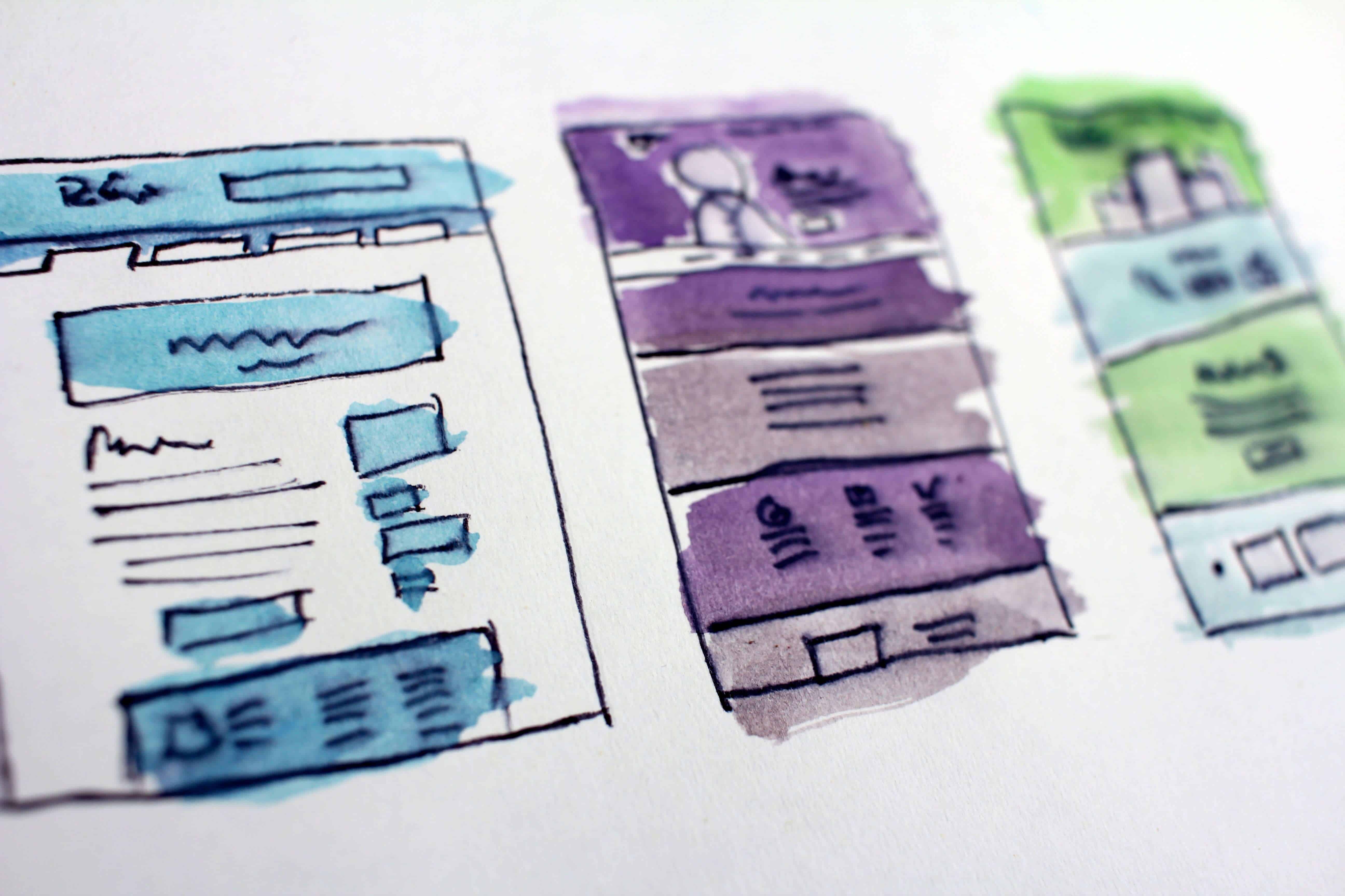
In our times, it seems everybody knows that an e-commerce store has less than 5 seconds to grab the visitors’ attention. The design and layout of your store do matter. Similarly as picking the right name for your eCommerce website to appear in domain lookup searches. But an appealing design should be essential for you.
So, you should manage what your customers see first. If the homepage interface and navigation are not appealing for the e-commerce visitors they will leave the site immediately. In order to guide the customers through your site, double-check the following elements:
- Good looking logo
- Calls to action to encourage people to make the needed action
- A simple search at the top of the site
- Links to the most popular products
- Special deals, promotions
- Latest news
- Language options

Design and layout of your store do matter. Unsplash
To put it bluntly, you need your eCommerce website design to have a simple and mobile-friendly design providing an intuitive user interface. Whatever placement of elements you go for just make sure it is convenient for your shoppers.
Should you create a website design from scratch or use a ready-made web theme? Check our Theme-Based vs. Shops Built with Most Popular Shopify Themes guide to learn more.

Not yet making money online?
Start your own dropshipping business. Sign up for a free trial of DSM Tool and we’ll help you get started. Today is the day.
2. Content & Optimization
The e-commerce industry is all about attracting customers with creative and vibrant content that engages the audience. So, try your best to create catchy content. Typical e-commerce stores have three types of pages. They are landing pages, product detail pages, and policy pages. All these pages need contents of different type and complexity.
Do you know that without proper optimization, your eCommerce store has poor chances to profit? Your content optimization means higher search engine results rankings. And as a rule, this requires changes in content structure, adding more keywords and including such visual elements as videos and images.

Adding more videos and images is a part of the optimization process. Unsplash
3. Product Description
Many website visitors land on product detail pages because this is where the main focus is at. The success of these pages is determined by the prominent item presentation. E-commerce stores should display products with stunning visuals and well-written descriptions.
How to make the product page even more attractive? Add several beautifully-captured images of the product. Want more? Then add video reviews to those pages. It should increase the credibility and help your visitor make the decision about the purchase.

The success of these pages is determined by the prominent item presentation. Behance
4. Checkout Page
According to Baymard Institute, more than 30% of users leave a checkout process because it is too complicated and/or too long. A Kissmetrics research says that a checkout process should be flawless and shouldn’t prompt the user to signup while checking out.
So, check your payment gateway settings to make sure everything works as it’s very important! Make certain that people can actually complete a purchase.
Can you make your e-commerce checkout process more user-friendly? It should not take more than three clicks.

Make your e-commerce checkout process as friendly as possible. Pixabay
5. Other Standard Pages
Homepage: Your homepage is perhaps the most relevant page on your e-commerce website. It’s mostly the first place people land or the second place they go. The clear navigation will guarantee that it’s quite easy to get to your store, with online marketplace stores, that will be your storefront.
Contact page: The potential clients should be able to contact you with questions. Otherwise, you could be losing lots of sales opportunities. And you don’t want that, right? Provide your clients with the information on how they can get in touch with you on the contact page. Make it easy for shoppers to contact you. It’s more convenient to use a contact form so they can send you a message immediately without leaving the site.

Contact page provides your customers with the ways they can get in touch with you. Pexels
About page: This type of page is created so that the customers can learn more about your company and your brand. It is also an effective tool to drive sales. Here’s the perfect guide to writing a convincing dropshipping about us page.
FAQs: At launch, you may have lots of information to share with the customers. Or even if you don’t, try to predict the possible questions or inquiries. Have a look at your competitors to see what questions they answer on their website. Consider including questions about shipping, return policy and ways to get in touch.
Go over the most successful eCommerce stores in your niche to get more inspiration and see how their e-commerce websites are done.

Don’t wait for the profits, make them!
Start a profitable dropshipping business with DSM Tool. Get a free course and a free trial of the software.
Conclusion
Got everything checked in your list? Well done! You are ready to launch your first online store!
Remember that building a website is only half the battle. Once it’s finally set up you will have to track analytics and regularly review your product listings, among other important tasks. So, have a pleasant journey and good luck!

